Building with Claude Code -- Week 3: Designing the Experience
Week 3 shifted from content to craft. Visual identity, 3D experiments, and a new way of working: voice-driven live coding.
Previously
Week 1 was about velocity. Building everything from scratch. Week 2 was about identity, finding my voice, and documenting a decade of lighting design work.
Week 3 is about something different entirely: how should this all feel?
The foundation was solid. The content was there. Now the question became visual. Not “what goes on the page” but “what happens when someone lands on it.”
Week 3 Results Overview
| Item | Detail |
|---|---|
| 3D hero page | Promoted from /lab/hero to homepage |
| 3D scene iterations | 24 documented revisions |
| Model optimization | FBX 33.8MB to GLB+Draco 274KB (99.2% reduction) |
| Visual alignment | Dark mode default, Montserrat headings, wider spacing |
| Header redesign | Full-width layout, social icons moved to footer |
| Blog simplification | Removed sorting, subtle expandable search |
| Works filter | Two-tier category system (Lighting Design / Creative Technology) |
| Hero animation | Gentle fade-in reveal for text elements |
| New workflow | Voice-driven live coding |
| Date bug fix | Timezone-safe date rendering across all pages |
| OG metadata | Extended description to 155 chars for better social sharing |
| Asset optimization | Images 379MB to 121MB, videos 317MB to 96MB, removed unused PLY files |
| SEO & GEO baseline | First tracked Google ranking (#1 for name) and Gemini AI response |
| Works page experiment | New grid layout with hover-triggered slideshow and background reveal |
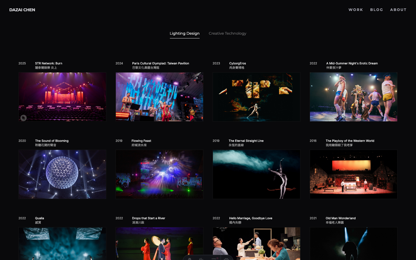
| Works page promoted | Experiment2 becomes official Works page |
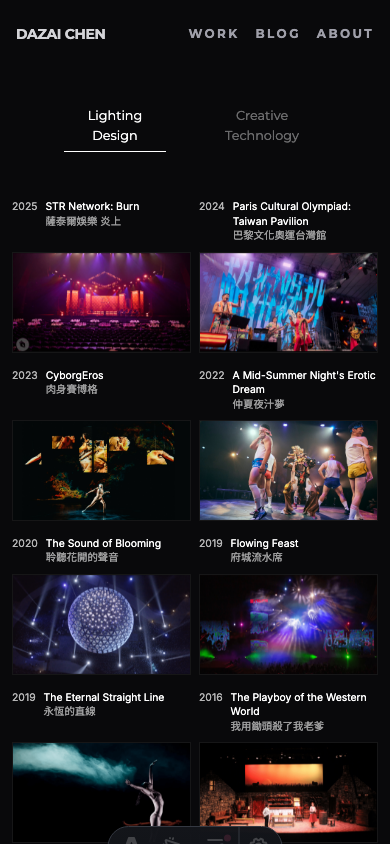
| Mobile optimization | Subgrid alignment, disabled hover, direct navigation |
| Nav bar unification | Consistent minimal nav across all pages |
| Typography system | Montserrat for identity, Inter for content, font audit cleanup |
| Mobile hero image | Full 16:9 photo visible on mobile (no cropping) |
| Language switcher | Added to Blog listing and detail pages |
| ZH Works page | Replaced old WorksFilter with new grid layout |
| Vercel Web Analytics | Added self-hosted analytics tracking across all pages |
The Shift
The first two weeks had a natural momentum: there was always something to build, something to write, something to organize. The to-do list drove the work forward.
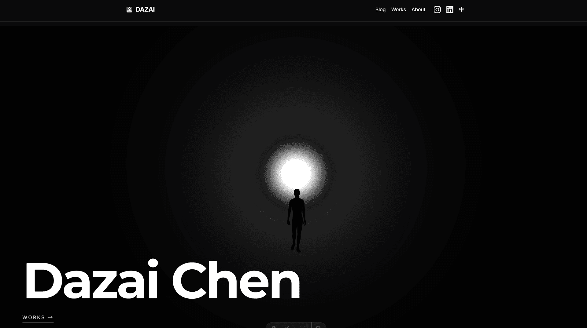
Week 3 started with a different kind of question. Not “what’s missing?” but “what’s the first impression?” I had a working portfolio site with solid content, but the homepage felt… safe. A background image, centered text, two buttons. It could have been anyone’s site.
For a lighting designer, that felt like a missed opportunity.
Day 15: The Hero Experiment
Finding References
I started by looking at creative portfolios that left an impression. Two sites stood out:
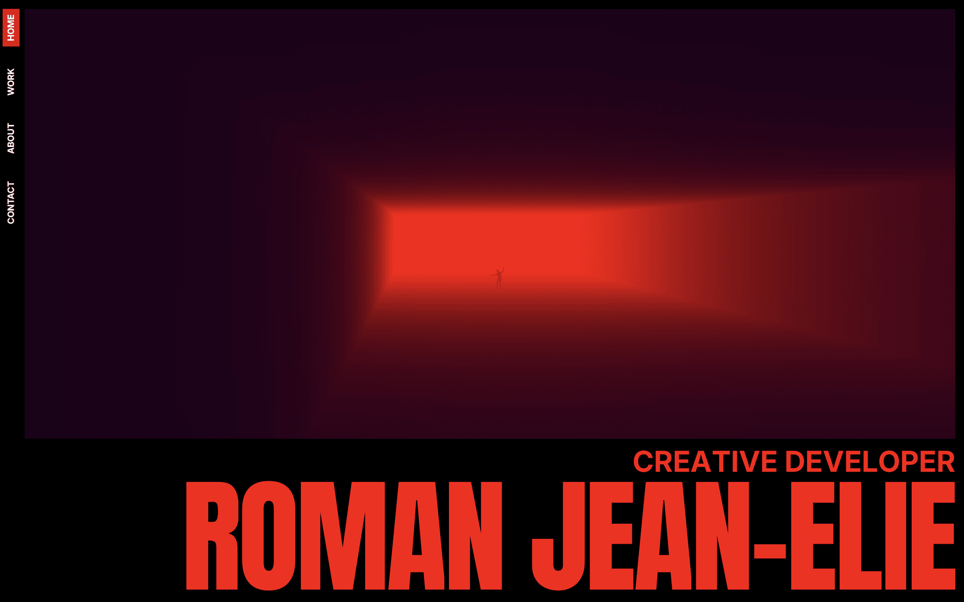
- romanjeanelie.com: A creative developer whose hero page uses light, fog, and a figure in a corridor to create immediate atmosphere. It doesn’t explain anything. It just feels like something.
- samanthairina.com: Bold typography, confident layout. The kind of design that knows what it wants to be.
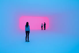
Another key reference: James Turrell’s light installations, where people stand inside color-saturated spaces, dwarfed by pure light. That sense of scale and atmosphere was exactly what I wanted.
The common thread: both sites made a statement in the first second. No scrolling required.
From Sketch to Scene
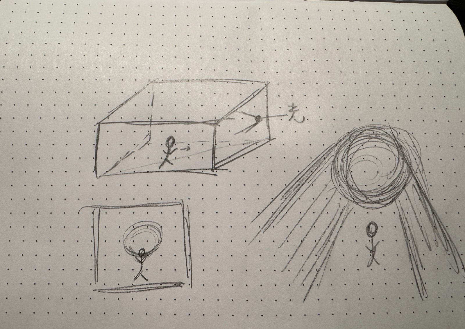
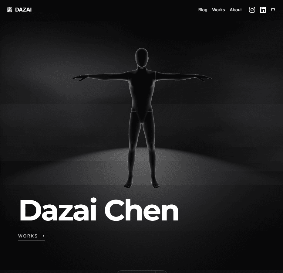
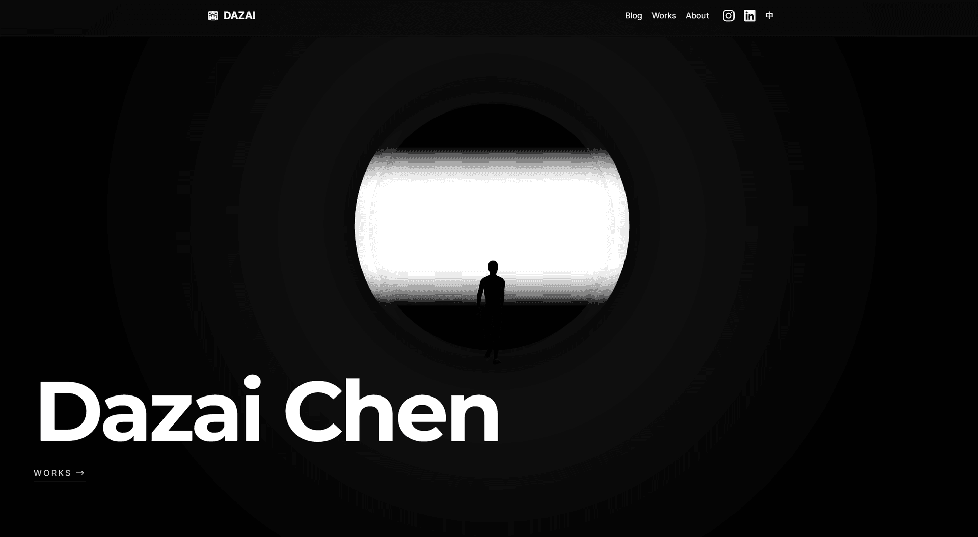
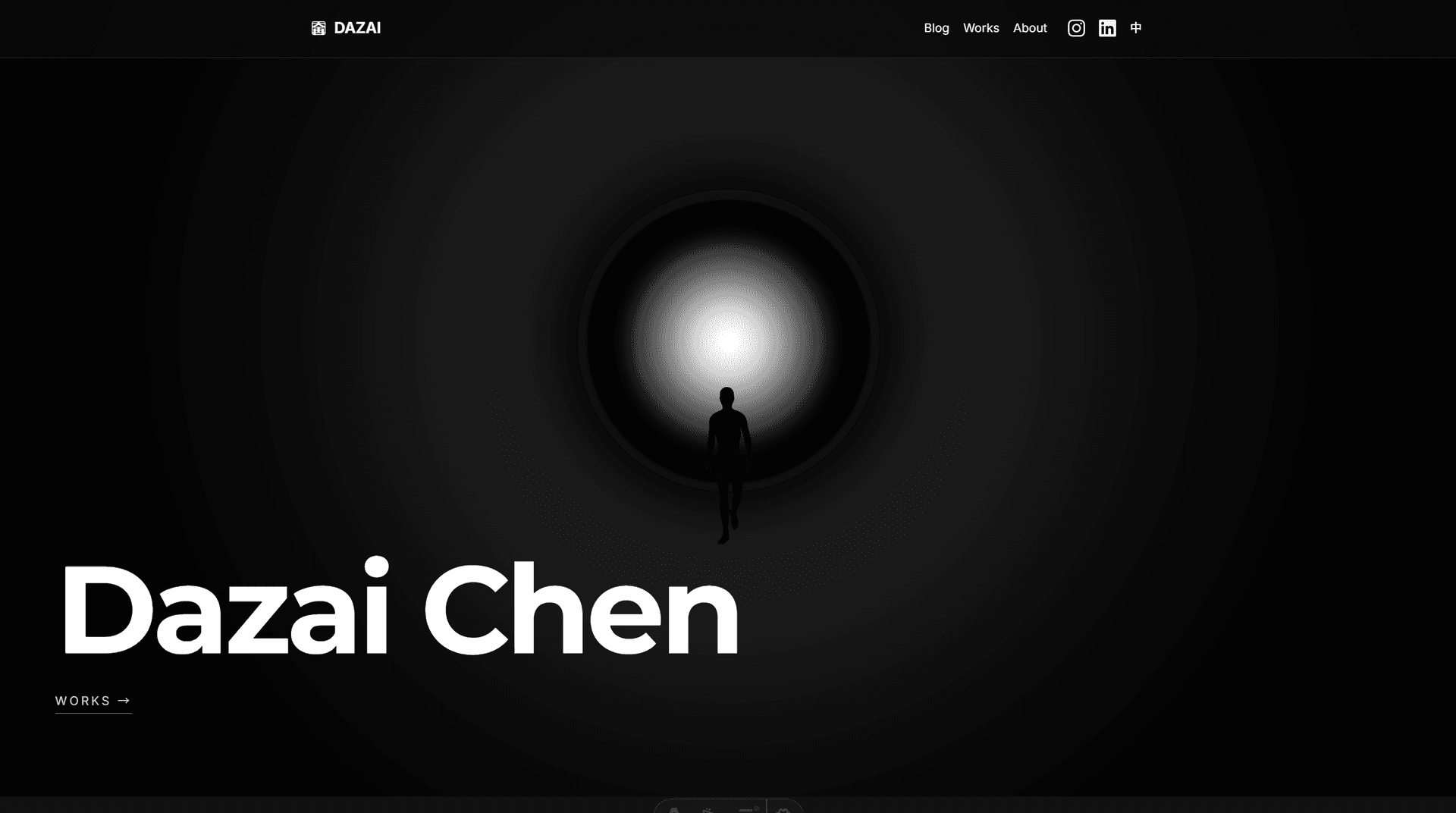
I drew a rough sketch of what I wanted: a 3D space, a strong light source at the end of a corridor, smoke or fog filling the space, and a human figure walking slowly. Something that felt like a stage, like the kind of environments I design lighting for.
The technical journey went through many iterations:
- Shader-based volumetric fog (too laggy, 40 ray steps with FBM noise)
- Icosahedron with glow (wrong vibe, looked like an object, not a space)
- Optimized raymarching (better performance, but felt 2D)
- Full 3D scene (the breakthrough, real perspective and depth)
The final approach: a Three.js scene with a cylindrical tunnel (inspired by James Turrell’s light installations), a glowing plane at the far end, fog, and a walking character loaded from Mixamo.
The Evolution
The walking figure came from Mixamo, Adobe’s free character animation library. I picked a standard walk cycle and exported it as FBX, then converted it to a compressed GLB for the web.
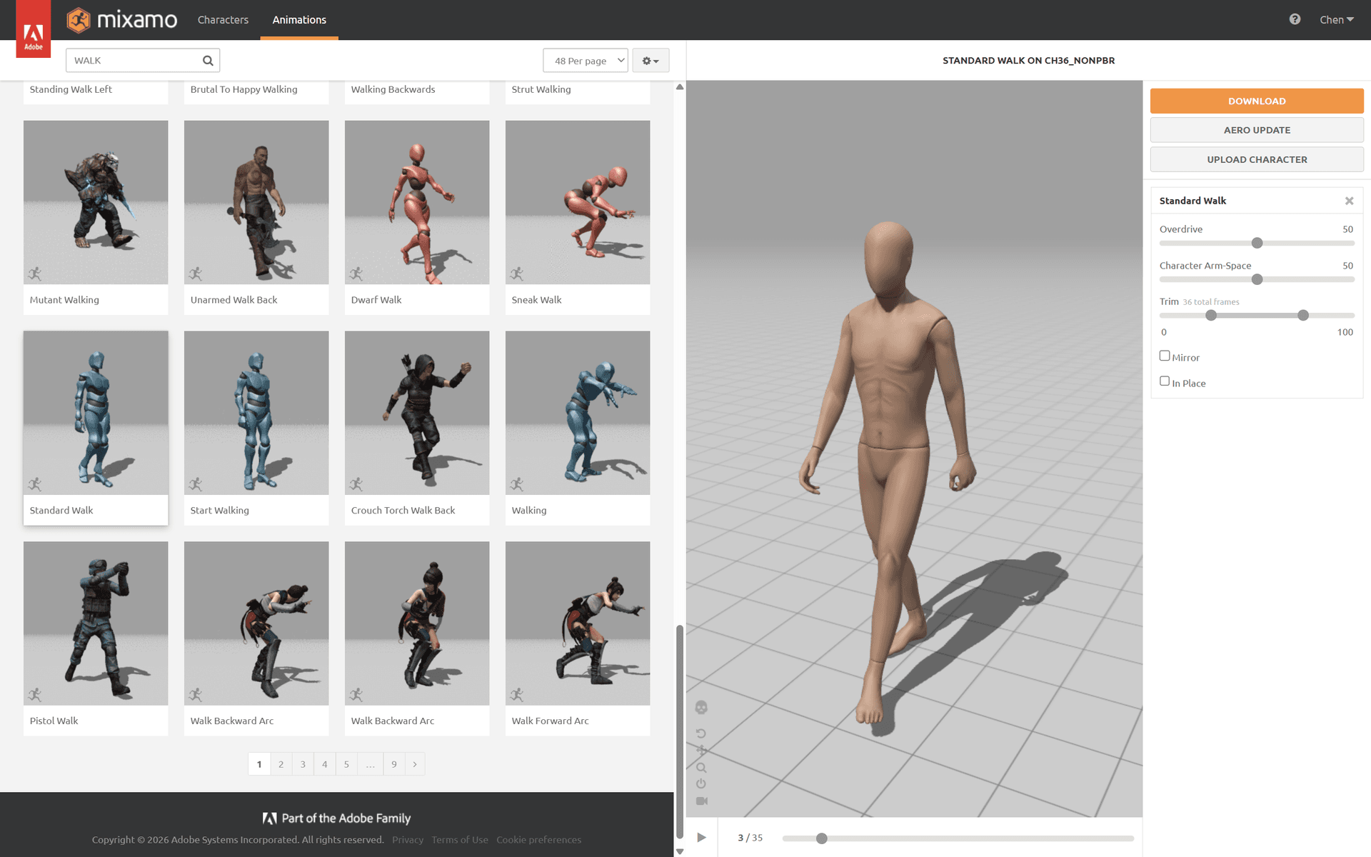 Selecting the walking animation from Mixamo’s library.
The hero page went through 24 documented iterations in a single day. Here’s the progression:
The final result in motion:
Tuning Like a Lighting Designer
This is where the process became genuinely interesting. Once the basic scene was built, the work shifted to parameter tuning: glow intensity, fog density, light distance, halo falloff, camera position.
It felt exactly like focusing lights in a theater. Except instead of calling out cues to a board operator, I was calling them out to Claude Code:
- “GLOW 50 POINT LIGHT 300”
- “Halo opacity .4, falloff 2”
- “Move the person 5 units toward the light”
- “The background is too black, make it a subtle dark gray”
Dozens of micro-adjustments, each one taking seconds. The feedback loop was immediate: say it, see it, adjust.
The Breathing Light
One small detail that made a big difference: the light breathes. A slow sine wave (0.3 Hz) modulates the glow intensity between 85% and 100%. It’s subtle enough that you might not consciously notice it, but it makes the scene feel alive. The shader uniforms, point light, and rect area light all breathe in sync.
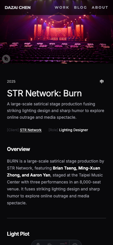
Promoting the Hero
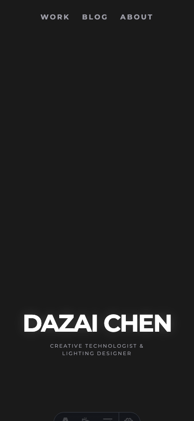
The experiment worked. The 3D hero felt right. So it became the real homepage.
This meant solving a few practical problems:
Technical details: model optimization & deployment
Model Optimization: The original walking figure from Mixamo was a 33.8MB FBX file. That’s unacceptable for a homepage. The optimization pipeline:
- FBX to GLB conversion using a custom Node.js script with three.js (which required polyfilling browser APIs like
Image,FileReader, andnavigatorin Node) - Draco compression via gltf-transform CLI
- Result: 274KB. A 99.2% reduction.
Production Deployment: The 3D model loaded fine locally but failed in production. The issue: the Draco decoder was loading from Google’s CDN (gstatic.com), which was unreliable in production environments. The fix was simple but important: bundle the Draco decoder files (draco_decoder.js, draco_decoder.wasm, draco_wasm_wrapper.js) locally in public/draco/.
Aligning the Rest of the Site
With an immersive dark hero page, clicking into Works or Blog felt jarring. The inner pages were still using the original light-mode-first design with Inter font and conservative spacing. Time to align everything.
Details: what changed across the site
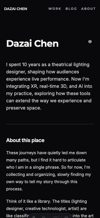
Dark Mode Default: Changed the theme initialization to default to dark mode. Users who previously chose light mode keep their preference (localStorage is still respected), but new visitors see the site the way it’s meant to be seen.
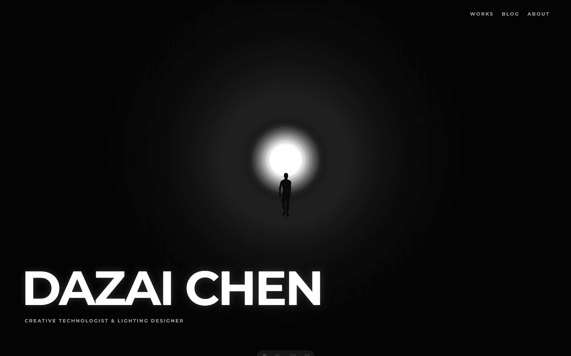
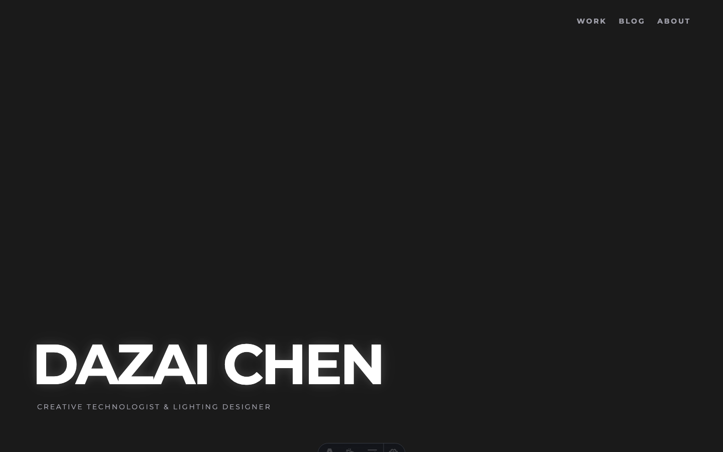
Typography: Montserrat (already loaded for the hero) was applied to all h1 elements globally, and to the header navigation links. The body text stays in Inter for readability. This creates a clear hierarchy: Montserrat for identity, Inter for content.
Spacing: Inner pages went from py-12 (48px) to py-20 (80px). More breathing room. The site needed to feel less like a dashboard and more like a curated space.
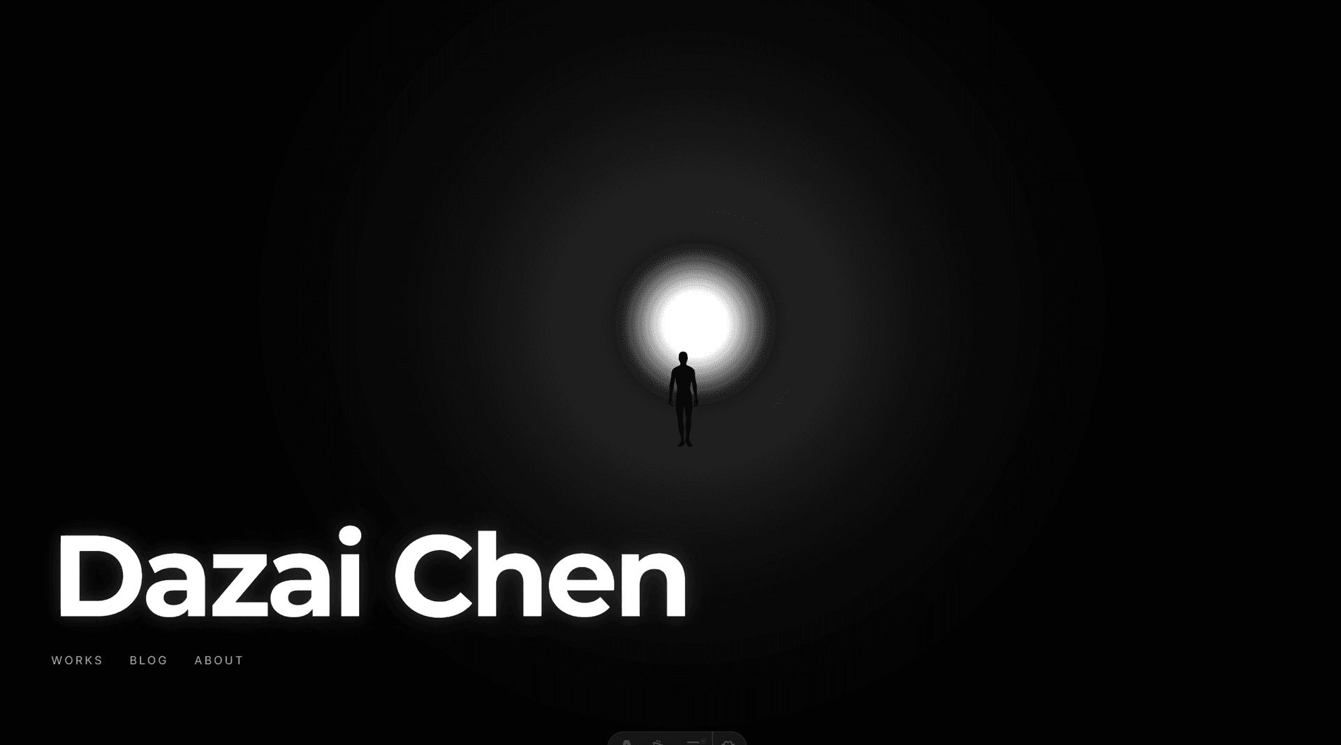
Header Evolution: The header went through its own transformation. Before: DAZAI logo with favicon icon, Blog, Works, About, IG, LinkedIn, EN/ZH, theme toggle. Seven items crammed on the right side. After: DAZAI CHEN in Montserrat, Works, Blog, About, EN/ZH. Social icons moved to the footer. Full-width padding matching the hero’s edge-to-edge layout. The result: the transition from hero to inner pages feels like one continuous experience, not two different websites.
Works Filter: The Works page got a two-tier filtering system. The top level splits into Lighting Design and Creative Technology. Each has sub-tags (Lighting Design: Musical, Comedy, Dance, Theatre, Festival, Installation, Experimental; Creative Technology: Unreal Engine, AI, Creative Coding, Research). This better reflects the actual structure of the work.
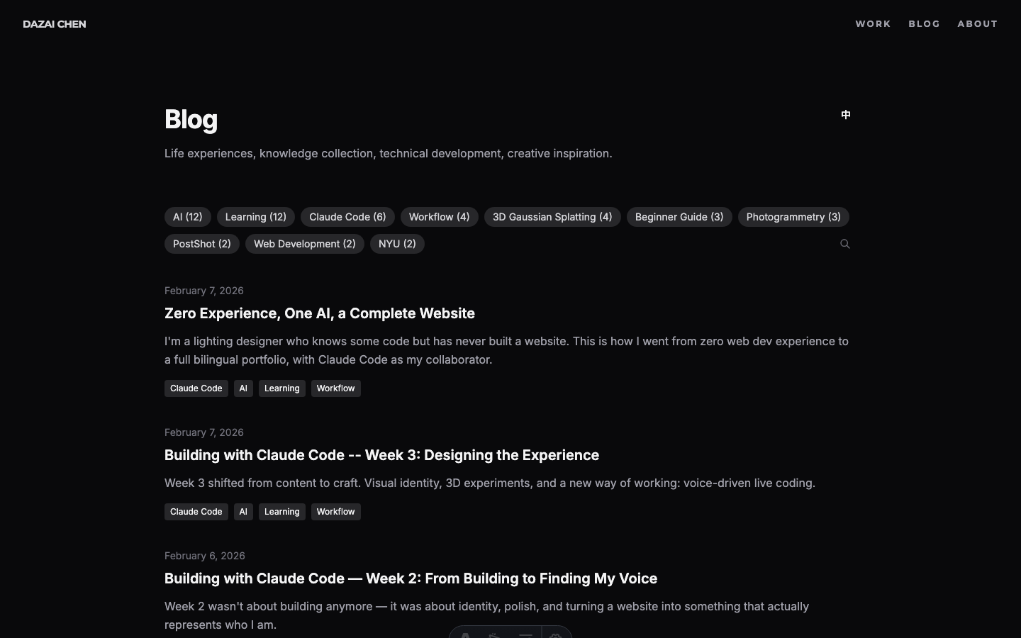
Blog Search: The blog page was over-designed. A big search input and a sorting dropdown that nobody would use. Stripped it down to tag filters, a small search icon at the end of the tag row that expands into a minimal underline input, and no sorting controls.
Dark Mode Per Page: Dark mode is now forced on all pages except blog articles, where the toggle remains. Reading long-form text in light mode is a valid preference. Everything else is the brand experience.
The Animation Question
The last detail: how should the hero text appear?
The first attempt was a slide-up fade-in. Too flashy. Then a scale-up with opacity. Still too “pop-in.” After several iterations, landed on pure opacity fade with staggered timing:
- 0.5s: Name fades in (3s duration)
- 1.2s: Subtitle and navigation fade in together
No movement, no scale. Just light emerging from darkness. Like a slow fade-up on a theatrical dimmer.
Going Typeless
Something else changed this week, and it might be more significant than the visual experiments.
Starting Day 15, I stopped typing.
Using Windows’ built-in voice input (Win + H), I began doing all my live coding sessions entirely by voice. No keyboard for prompts, no carefully composed commands. Just talking.
Why Voice Changes Everything
The obvious assumption is that voice is about speed. It’s not. It’s about completeness.
When you type, you instinctively compress. You write “make the light brighter and further away.” It’s efficient. It’s also incomplete.
When you speak, you naturally elaborate. You say: “I want the light source to feel further away but also brighter, so it has that quality of looking down a long corridor toward something intense, like a Turrell installation.” Same intent, but now the AI has context about the feeling, the reference, and the spatial relationship.
This matters because the hardest part of AI-assisted work isn’t getting the AI to execute. It’s communicating what you actually want. Voice removes the friction that makes you self-edit your own intentions.
The Natural Loop
Voice creates a more natural collaboration cycle:
- Express freely, from multiple angles, without worrying about formatting
- AI understands more fully, because it receives richer context
- AI proposes options that are closer to what you actually imagined
- You refine from those options, or redirect with another spoken thought
With typing, step 1 often becomes “issue a command.” With voice, it becomes “describe what I’m thinking.” For design work, the second approach is dramatically more effective.
A Familiar Mode
For a lighting designer, this workflow is oddly familiar. In theater, you don’t program lights yourself. You sit in the house, look at the stage, and tell the board operator what you want: “Bring up the back light, warmer, more from stage right, slowly.” The operator translates your artistic direction into technical action.
Voice-driven AI coding is the same dynamic. The “operator” is now Claude Code, but the mode of working (watch, feel, direct) is identical.
Current State
Here’s where the site stands at the end of Week 3:
The Invisible Work
Not everything this week was visual. Some of the most important changes were things nobody would ever see.
Timezone bug
Dates were showing wrong. An article published on February 7 would display as February 6 on the blog listing page. The cause: JavaScript’s Date object interprets ISO date strings as UTC midnight. In a negative UTC timezone (like New York, UTC-5), that midnight rolls back to the previous day when converted to local time.
The fix was systematic: every toLocaleDateString() call across 12 template files needed timeZone: 'UTC' added. The client-side components (BlogSearch, WorksFilter) needed a different approach: parsing the date string directly instead of creating a Date object from an ISO string.
OpenGraph metadata
The site’s default meta description was only 54 characters: “Dazai Chen - Creative Technologist & Lighting Designer.” Social sharing tools flag anything under 110 characters as too short. Extended it to 155 characters to give platforms more context to display.
Asset optimization (777MB to 251MB)
Vercel’s free tier hit 75% bandwidth usage. The culprit: uncompressed assets. A single portfolio page could serve 20-30MB of production photos.
Built a compression pipeline with sharp (for images) and ffmpeg (for videos):
| Asset type | Before | After | Reduction |
|---|---|---|---|
| Images (175 files) | 332MB | 74MB | 78% |
| Videos (22 files) | 270MB | 55MB | 80% |
| Unused 3D models | 47MB | removed | 100% |
| Total | 777MB | 251MB | 68% |
The images were resized to max 1920px width and recompressed at 80% quality. The videos were re-encoded at CRF 28 with H.264. Visually identical on screen, but a fraction of the file size.
SEO & GEO: Establishing a Baseline
Three weeks into the site, I realized I should have been tracking something from day one: how search engines and AI models describe me.
This is an oversight worth documenting. When you build something in public, you want to see the impact over time. But without a baseline, you can’t measure change. By the time I thought to check, three weeks of potential data was already gone.
So here’s the Week 3 baseline. I’ll track this going forward.
Google Search: “dazai chen”
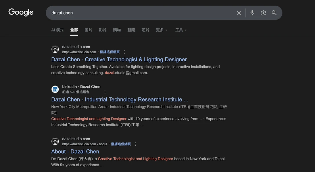
The site ranks #1 for my name. The meta description pulls from the About page: “Creative Technologist & Lighting Designer.” The About page appears as a separate result at #3, below LinkedIn at #2.
Gemini (GEO): What does an LLM say about me?
This is the newer, less obvious metric. When someone asks an AI “who is Dazai Chen?”, what comes back?
A key observation: Gemini’s response not only accurately describes my background (creative technologist, lighting designer, NYU IDM, ITRI), but the “Sources” panel on the right directly cites my website’s About page and homepage as references. This means the site’s structured content is already being indexed and used as a knowledge source by LLMs.
GEO (Generative Engine Optimization) is still a new concept. Unlike traditional SEO where you optimize for ranking position, GEO is about how AI models understand and represent you. The structured content, clear metadata, and bilingual pages on this site are all signals that LLMs can parse.
Why This Matters
This goes on the “things I wish I’d done from Day 1” list. If you’re building a personal site, take screenshots of your search presence before you start optimizing. Future-you will want that comparison.
I’ll revisit this in Week 4 and beyond.
The Works Page Experiment
With the hero page feeling right, the next question was: what about the Works page?
The existing Works page was functional: a grid of cards with category filters. It worked. But it didn’t feel like anything. For a lighting designer’s portfolio, the works page is arguably the most important page on the site. It should make an impression.
Finding References
Before building anything, I looked at creative studio portfolios that handled project grids well:
The common thread: the grid itself is the navigation. No sidebar, no filters dominating the page. Just images and interaction.
Attempt 1: Scroll-Based Layout
The first experiment was a scroll-driven approach, testing both vertical and horizontal scrolling. The idea was to let each project take up more space, giving the images room to breathe.
But it felt disconnected. Scrolling through isolated cards doesn’t create the sense of a body of work. It felt like flipping through a catalog.
Attempt 2: The Grid
The second approach was a dense 5-column grid showing all projects at once. No scrolling needed. Every project visible on a single screen. This immediately felt more like an overview of a career.
But a static grid is just a contact sheet. The interesting part was figuring out what happens when you interact with it.
The Hover System
The design went through many iterations:
1. Breathing animation on all cards (subtle opacity pulsing). Looked busy, removed it.
2. Scale on hover (1.2x, then 1.15x) with labels appearing on all cards. Felt gimmicky once the background feature existed.
3. Background reveal: When hovering a card, the entire page background crossfades to that project’s photo. This was the breakthrough. Suddenly each thumbnail is a portal to the full image.
4. Ken Burns effect: The background slowly zooms in, just 5% over 12 seconds. Barely noticeable, but it keeps the image alive.
5. Non-hovered cards fade to transparent (opacity 0), so the background image fills the visual field. Only the hovered card stays visible at 80% opacity.
6. Bilingual labels: English title + Chinese title above each thumbnail, dimmed on non-hovered cards.
Image Slideshow
The final addition: each card cycles through 3-5 production photos while hovered.
The cycling only starts on hover (default state is static). Each image crossfades over 2 seconds, with 3 seconds between changes. On mouseleave, the card stays on whatever image it last showed.
The background follows the cycling, so as the thumbnail changes, the full-screen background crossfades to match.
Getting this smooth required several technical fixes:
Technical details: crossfade & race conditions
- Preloading: All ~80 slideshow images are loaded into browser cache on page load, so crossfades never stall waiting for a download
- Dual-layer crossfade: Two stacked
<img>elements per card, alternating opacity for seamless transitions - Dual-layer background: Same technique for the full-screen background (bg-a / bg-b layers)
- Race condition fix: When quickly moving between cards,
mouseenteron the new card can fire beforemouseleaveon the old one. Without handling this, the leave handler would reset the state that the enter handler just set up.
What Didn’t Work
Several ideas were tried and abandoned:
- Text animating to center on hover: Moving the title from above the image to the center of the image. Too abrupt, even with transitions.
- Ripple effect: On mouseleave, all cards change images in a wave pattern radiating outward from the card you just left. Cool concept, but the visual result was chaotic.
- Sequential left-to-right cycling: All cards cycle automatically in order. The staggered timing felt random rather than rhythmic.
The lesson: sometimes the simplest interaction (hover to reveal, leave to freeze) communicates more clearly than clever animation.
From Experiment to Production
The experiment worked. So it became the real Works page.
Promoting an experiment to production sounds simple, but it surfaced a whole wave of refinements. The experiment was built for desktop. The real page needs to work everywhere.
Mobile
The biggest challenge was mobile. A hover-driven grid doesn’t translate to touch screens. Rather than trying to simulate hover with tap-and-hold or other workarounds, I took a different approach: strip it all out on mobile.
No hover slideshow. No background reveal. No click animation. On mobile, the grid is just a grid. You tap a card, it navigates directly. No black flash from half-finished animations, no awkward interaction patterns.
The grid itself needed work too. Long project titles in Chinese would push images down unevenly across columns. CSS subgrid fixed this: each card spans two rows (label + image), and labels use align-self: end so images always align horizontally regardless of title length.
The final page transition from Works grid to detail page.
Unifying the Navigation
With the Works page looking different from every other page, the navigation bar became inconsistent. The hero page had its own style. Blog and About used the old Layout header with backdrop-blur, hamburger menu, and theme toggle.
The fix was radical: rip out the old header entirely. Replace it with the same minimal nav the Works page uses.
The new header across the entire site: DAZAI CHEN on the left (Montserrat, bold), WORK / BLOG / ABOUT on the right (Montserrat, uppercase, letter-spaced). No backdrop blur. No hamburger menu. No theme toggle.
One bug took a while to find: the detail page nav had a class attribute specified twice on the same HTML element (class="header-reveal" class="px-4 md:px-8"). In HTML, duplicate attributes are silently ignored. Only the first one applies. So the padding classes never took effect, making the detail page nav look different from the Works page nav. Merging them into a single class attribute fixed it.
Typography Audit
The visual inconsistency between pages led to a full typography audit. What I found:
- Source Serif 4 was being loaded from Google Fonts but never used anywhere. Removed.
- Montserrat was only loaded at weight 700, but the category tabs were set to weight 400. The browser was faking the lighter weight. Added weight 400 to the import.
- A global CSS rule was applying Montserrat to all
h1elements, affecting pages that shouldn’t have it. Removed the global rule and applied Montserrat explicitly where needed.
The result is a clear two-font system: Montserrat for navigation and identity elements (site name, nav links, page titles, tabs), Inter for content (body text, descriptions, metadata).
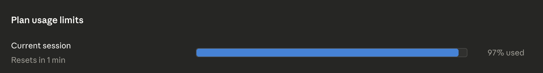
A typical session: Claude Code handling 97% of the token usage. The remaining 3% is me, mostly talking.
Reflections
The shift from “building” to “designing” is a different kind of challenge. Building has clear metrics: does it work? Designing has a harder question: does it feel right?
What surprised me most this week was how naturally the voice-driven workflow fit into design iteration. When you’re making dozens of micro-adjustments to light, spacing, and timing, the ability to just talk about what you want, without translating it into typed commands, changes the speed and quality of the work.
The 24 iterations of the hero page happened in a single afternoon. Each one was a spoken adjustment: “darker,” “softer,” “move the figure closer,” “add fog.” That kind of rapid iteration would have been tedious with typing. With voice, it felt like a conversation.
Related Articles
- Building with Claude Code — Week 2 - Finding my voice
- Building with Claude Code — Week 1 - Building from zero
- What is Claude Code? - Full feature breakdown
- Claude Code for Beginners - Installation guide
Sources
- Claude Code Documentation - Official docs
- Anthropic - The company behind Claude
Get in Touch
Want to learn how to use Claude Code, or start building your own website with it? Fill out this form and I’ll get in touch!